福特赛普字体家族
Fortescue Pro Font Family
Originally drawn in 2009, for artist Jake Spicer as part of small website and branding project, over a period of nine months, the typeface was initially commercially released in December 2009. The name ‘Fortescue’ derives from a dwelling in Sidmouth, Devon (UK) where the artist began his career.
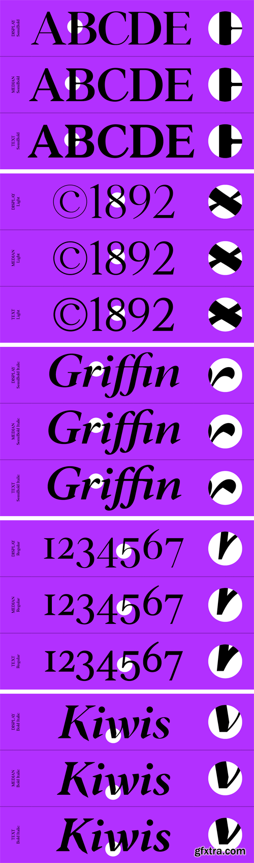
Over the years Fortescue has been utilised in a variety of settings and applications, including GQ Magazine (Germany) where bespoke variants were produced. As part of our larger work to re-master and extend our full commercial library, the Fortescue family has been extended, refreshed and remastered into further weights, language support, OpenType features and styles. Updated in 2019 to span three subfamilies, each with varying optical sizes – a Text variant; for text and running copy usage, where the contrast between stroke width is at its lowest, a Display; for larger usage cases, where the stroke width is at its highest and lastly a Median, that sits between Text and Display.
本站不对文件进行储存,仅提供文件链接,请自行下载,本站不对文件内容负责,请自行判断文件是否安全,如发现文件有侵权行为,请联系管理员删除。